Table of contents
- What are dark patterns?
- How do dark patterns work?
- Why dark patterns are so effective
- Dark patterns examples
- Are dark patterns illegal?
- How to avoid becoming a victim of dark patterns
- How Clario Anti Spy can support your privacy
- Conclusion
Have you ever tried to make an online purchase only to be badgered by pleas for you to buy an expensive add-on?
Perhaps you've been about to click the order button when you notice something in your cart that you didn't add.
Or maybe you’ve hit “Accept all cookies” thinking it’s the only way to get rid of the pop-up blocking your screen?
These all are examples of dark patterns — a manipulative strategy used by some of the biggest online retailers, services and sites around, often with their great success. Read more to learn how to avoid being tricked by them.
Dark patterns have become more sophisticated as websites compete for user attention, data, and recurring revenue. What once appeared as simple design nudges has evolved into carefully tested interface strategies informed by behavioral science, analytics, and experimentation. As regulators, designers, and consumers push back, understanding how these tactics work has become essential for navigating the modern internet safely.
Pro tip
Unfortunately, antivirus will not safeguard you from dark patterns. The only way to avoid them is to educate yourself and stay alert. However, an all-encompassing cybersecurity solution like Clario can protect you from malware threats and free up your attention, so you don't fall prey to shady schemes. To give Clario Anti Spy a go, download and try it now .
What are dark patterns?
Dark pattern design is part of a deceptive technique employed by websites and apps to trick you into handing over something valuable. This usually means your time, money, attention or data. Other examples include making it hard for people to cancel an app subscription (so called fleeceware apps) or unsubscribe from an email newsletter.
Dark patterns are everywhere. They have been of particular concern in user experience design for over a decade. Opting not to use them is a commitment to fairness and treating users with the respect they deserve.
Although there have been some legislative efforts to thwart dark patterns, one of the best things you can do to combat them is to understand what they look like and make sure you don't fall into the trap.
Expert's insight
In practice, dark patterns blur the line between persuasive design and deception. Ethical design helps users make informed decisions that align with their goals, while dark patterns intentionally steer users toward outcomes that primarily benefit the company. This distinction has become increasingly important as regulators and design professionals attempt to codify fair digital practices.
How do dark patterns work?
Dark patterns work because designers understand most people don't absorb all of a webpage’s information. We tend to skim pages, especially if they don't seem very interesting. Malicious designers take advantage of this with visual cues (which could be things like fake notification bubbles) or subverting expectations. For instance, they might make an "I agree" button red and a "Cancel" one green.
Researchers and regulators often classify dark patterns into several recurring categories. Interface interference uses visual hierarchy, color, or layout to privilege one option over others. Obstruction introduces unnecessary steps or friction to discourage actions like canceling subscriptions. Nagging repeatedly prompts users to make the same choice, while forced action requires personal data or consent to continue. Recognizing these patterns makes them easier to spot across different platforms.
The most common dark patterns fall into a few recognizable categories, each using different design tactics to influence user behavior and limit informed choice.
| Type of dark pattern | How it works | Common examples | Potential risk to users |
| Interface interference | Uses color, size, or placement to highlight one option while hiding others | “Accept all cookies” buttons that are visually dominant | Loss of privacy, unintended data sharing |
| Obstruction | Makes certain actions unnecessarily difficult or time-consuming | Multi-step subscription cancellation processes | Ongoing unwanted charges |
| Nagging | Repeatedly prompts users to make the same choice | Persistent pop-ups urging cookie or tracking consent | Decision fatigue, coerced consent |
| Forced action | Requires users to complete an action to continue | Mandatory account creation or data sharing | Reduced autonomy, data exposure |

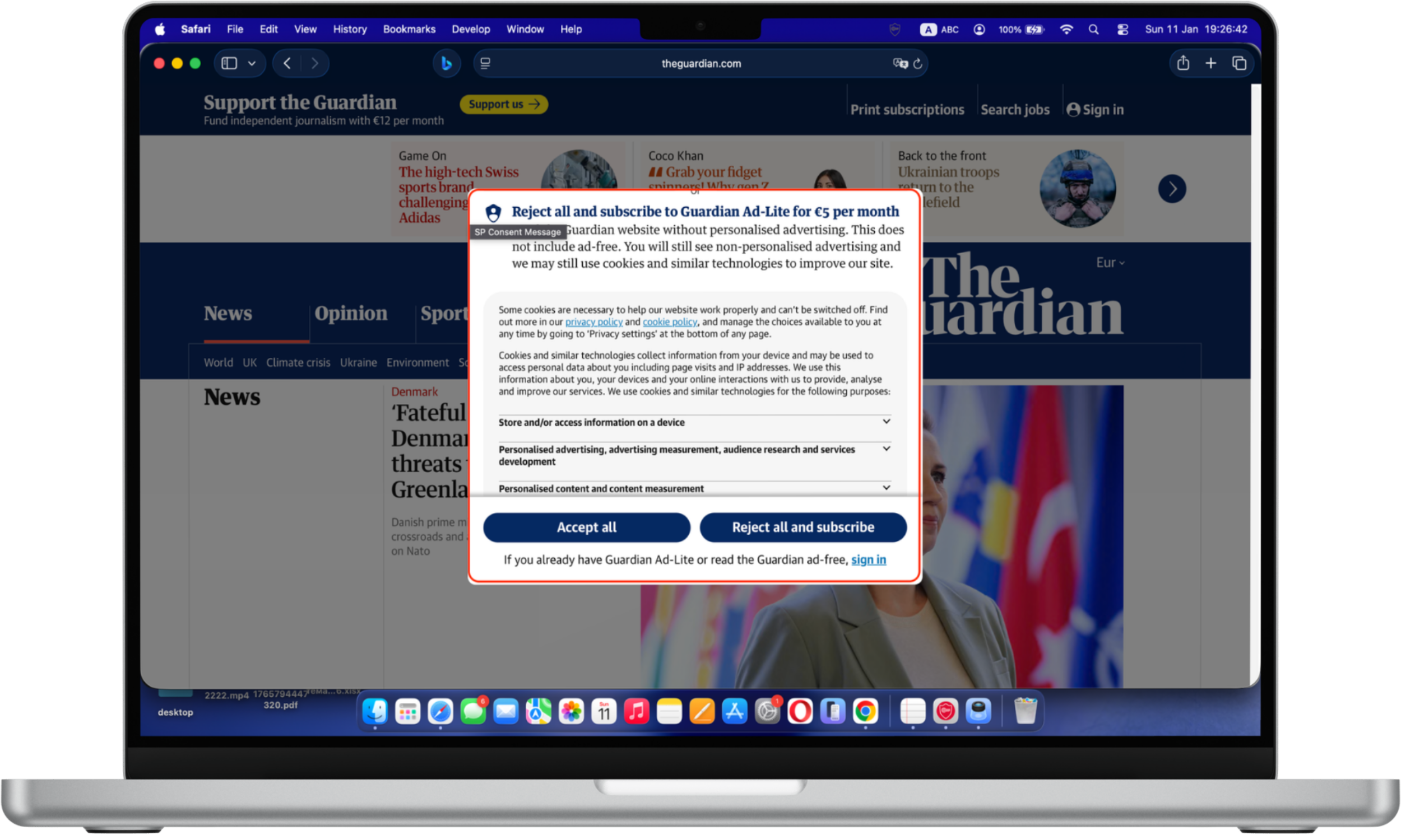
Manipulative cookies: The cookie consent window prioritizes the “accept” option through visual contrast and placement, while alternative choices require more effort to access. The “Accept all” button is visually emphasized through size, color contrast, and central placement, while the alternative option “Reject all and subscribe” is paired with additional cost information and more complex wording. This visual and cognitive imbalance can influence users to accept cookies quickly rather than fully evaluating their privacy choices.
Recent studies indicate that cookie consent interfaces remain one of the most widespread forms of dark patterns. Consumer protection researchers have found that users are significantly more likely to accept tracking when “accept all” buttons are visually emphasized or require fewer clicks than rejection options. As personalization and targeted advertising grow more sophisticated, cookie-related dark patterns continue to evolve rather than disappear.
The timing of introducing dark patterns is critical to making them successful. Interrupting you with a popup when you're in the middle of something could distract you and cause you to click without thinking clearly about your decision.
Sometimes, designers who create products people interact with (user experience, or UX design) aren't even aware they're tricking users. Many of them inherently understand the fundamentals of what works and how to push users to carry out an intended action. It's easy for users to abandon an app or website if a tap or click causes something frustrating to happen. It's often up to designers to make sure this doesn't occur.
So, it's typically in designers' best interests to guide users through processes and make their experience smooth. Manipulating the user's actions in such a way could be deemed an instance of a dark pattern, even if it's not intentionally malicious.
Why dark patterns are so effective
Dark patterns exploit well-documented cognitive biases such as default bias, loss aversion, and decision fatigue. When users are interrupted or overwhelmed, they are more likely to accept pre-selected options rather than evaluate alternatives. This is why dark patterns frequently appear during checkout, account deletion, or consent requests—moments when users are motivated to finish quickly.
Dark patterns examples
Independent audits of popular websites suggest that a majority employ at least one form of deceptive interface design. Subscription services, e-commerce platforms, and media websites are among the most frequent users, particularly in pricing, consent, and cancellation flows. Despite increased public awareness, dark patterns remain effective because they scale easily and often operate just below the threshold of regulatory enforcement.
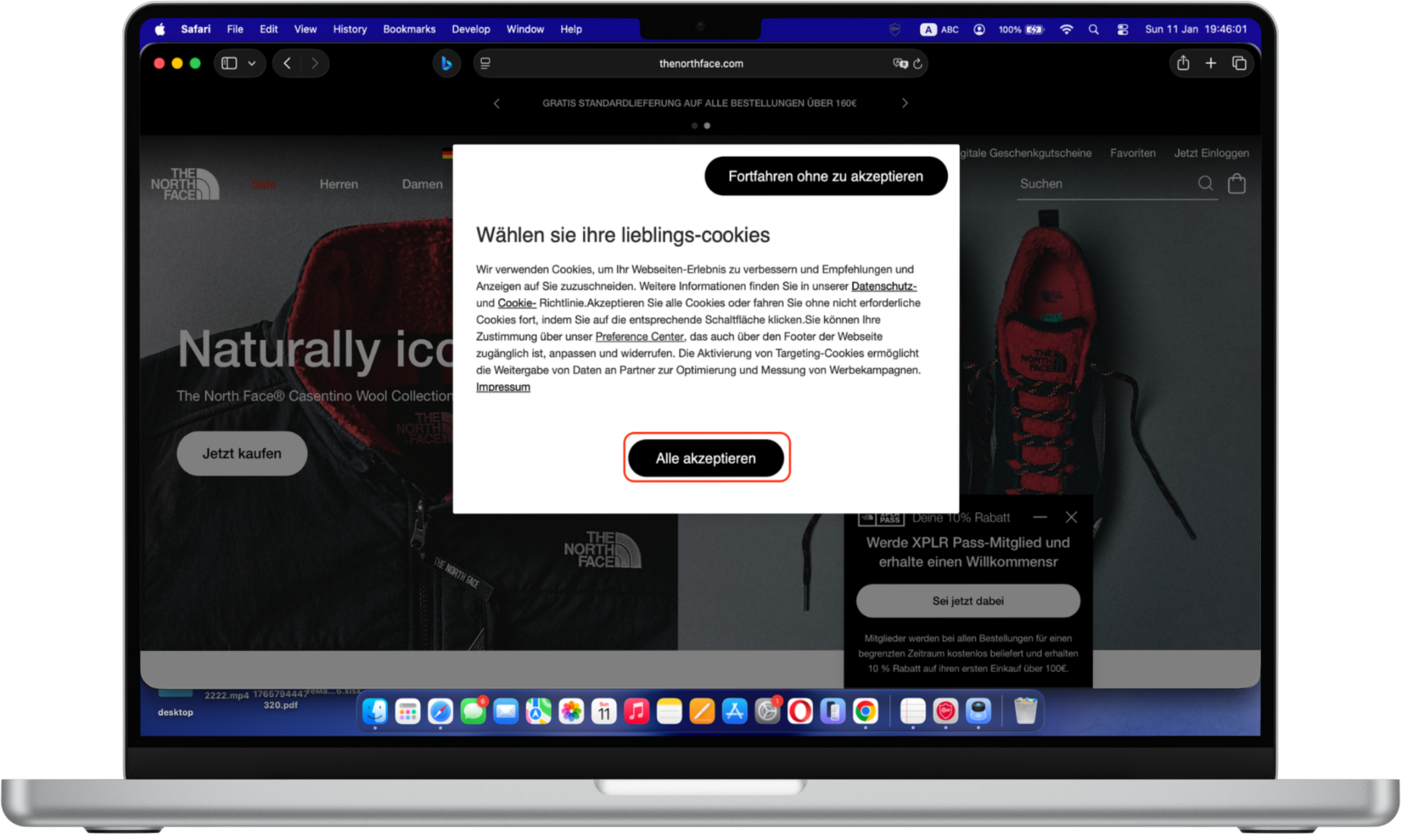
There's every chance you'll encounter a dark pattern UX when you visit a website for the first time. Most websites display a message to new visitors asking them to review the site's cookie policy. It often urges them to enable all cookies for the optimum experience.
Cookie policy pop-ups can be annoying. You might be tempted to click the Accept cookies button (or something similar) instead of clicking through and disabling all non-essential cookies. That can take just a few seconds, but it's a layer of friction many users don't bother dealing with.
According to Max Schrems, chair of privacy advocacy group noyb, "Companies openly admit that only 3% of all users actually want to accept cookies, but more than 90% can be nudged into clicking the ‘agree’ button."


You might run into dark UX when you try to unsubscribe from a service. Signing up for a subscription can take seconds. You plug in your personal information and payment details — after reading the terms of service, of course.
But canceling a membership can take a lot more work. Take the New York Times (NYT), for example. You can’t simply end your subscription by clicking a button on your account settings. Instead, you need to either call a customer care line or chat with an agent. That’s unethical design that benefits the NYT, as it places unnecessary hurdles between you and canceling a subscription.

Dark patterns can occur in something as commonplace as a website’s terms of service. Many of us have agreed to them without reading. They're often long, and we'd much rather just scroll to the end and hit Agree.
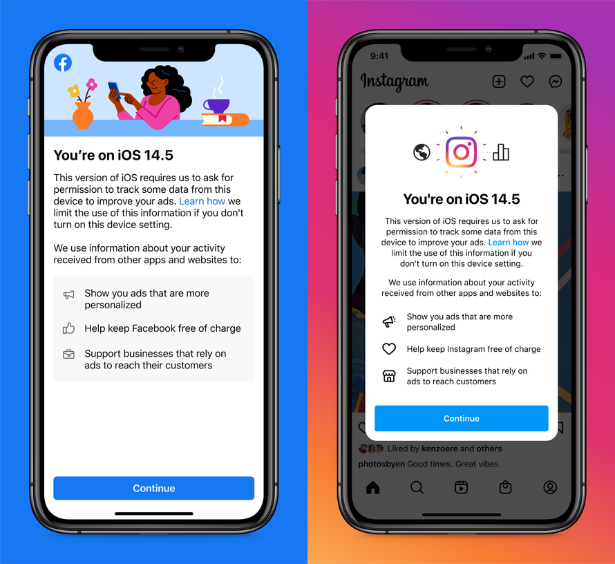
Designers might make the option to skip part of a signup process less prominent than prompts to provide a phone number or profile photo. Facebook's plea to iOS 14.5 users to enable cross-app tracking is another example of a dark pattern. Facebook says that turning on that device setting will “help keep Facebook free of charge.” That’s technically true, but it’s also subtly manipulative, as Facebook won’t suddenly start changing users to use the social network if they don’t enable cross-app tracking.

Similar tactics now appear across short-form video platforms, mobile games, and e-commerce apps. Time-limited offers, artificial scarcity warnings, and emotionally charged messaging are frequently personalized using behavioral data. These techniques make modern dark patterns harder to detect because they adapt dynamically to individual users rather than presenting a static interface.
Signing up for a subscription is often very easy, but you may encounter a dark pattern UX when you attempt to cancel it. A service may ask if you're sure you want to cancel, and then repeat the question and highlight the benefits of the plan after you say "yes." From one page to the next, the app or website may move the position of the cancel and maintain-subscription buttons to confuse you.
Whenever you make an online purchase, you’ll run into some manipulative design. Buy a product that’s part of Amazon’s subscribe and save program, and the website will automatically select the option for you to subscribe to the item, rather than just buying it once.
Are dark patterns illegal?
Some jurisdictions are tackling the problem of dark UX head on. Europe's General Data Protection Regulation gives consumers more control over their data. It bans apps and websites from certain forms of data collection without user consent. That means they need to explicitly ask for permission or face tough penalties.
In March 2021, California banned certain types of dark patterns. Specifically, the state will no longer allow instances that have “the substantial effect of subverting or impairing a consumer’s choice to opt-out” of programs that involve their personal data being sold.
Examples include requiring users to “click through or listen to reasons why they should not submit a request to opt-out before confirming their request” or adopting confusing or misleading language, such as double negatives.
Since 2022, enforcement against dark patterns has expanded significantly. In the United States, the Federal Trade Commission has explicitly identified certain deceptive design practices—particularly around subscriptions and data consent—as violations of consumer protection law. In the European Union, the Digital Services Act (DSA) and Digital Markets Act (DMA) now directly address manipulative interface design, extending protections beyond the original scope of GDPR.
How to avoid becoming a victim of dark patterns
The simplest thing you can do to avoid the trap of dark pattern design is to pay attention. Yes, terms of service are usually very boring and it's much easier to accept all cookies on a website by clicking once. But you might be agreeing to something that might come back to haunt you or giving up part of your privacy.
A practical approach is to slow down during key decisions. Be cautious of pre-checked boxes, confusing button labels, or language that frames one option as irresponsible or risky. If canceling a service requires significantly more effort than signing up, that imbalance is often intentional. Taking screenshots, reviewing subscription lists regularly, and using browser privacy tools can further reduce exposure.
It takes a little more time and effort to stay on the lookout for signs of dark UX and to do things we might not necessarily want to. The iOS 14 terms of service, for instance, clock in at around 7,000 words.
This might sound daunting, but it'd take most people under 25 minutes to read the whole thing. It’s only a modicum of time, given how much many of us rely on our phones. You'll have a better understanding of what you're actually agreeing to after you read it.
You can also inform your family, friends and co-workers about what to look for and how to steer clear of dark pattern manipulations.
Perhaps most importantly, you can flag dark patterns UX examples to digital advocacy groups. The Electronic Frontier Foundation, Consumer Reports, Access Now, PEN America, and DarkPatterns.org have opened a Dark Patterns Tip Line, where you can report those tactics and help put pressure on companies to stop using them. Perhaps that way, companies will adopt fairer and more ethical design practices.
How Clario Anti Spy can support your privacy
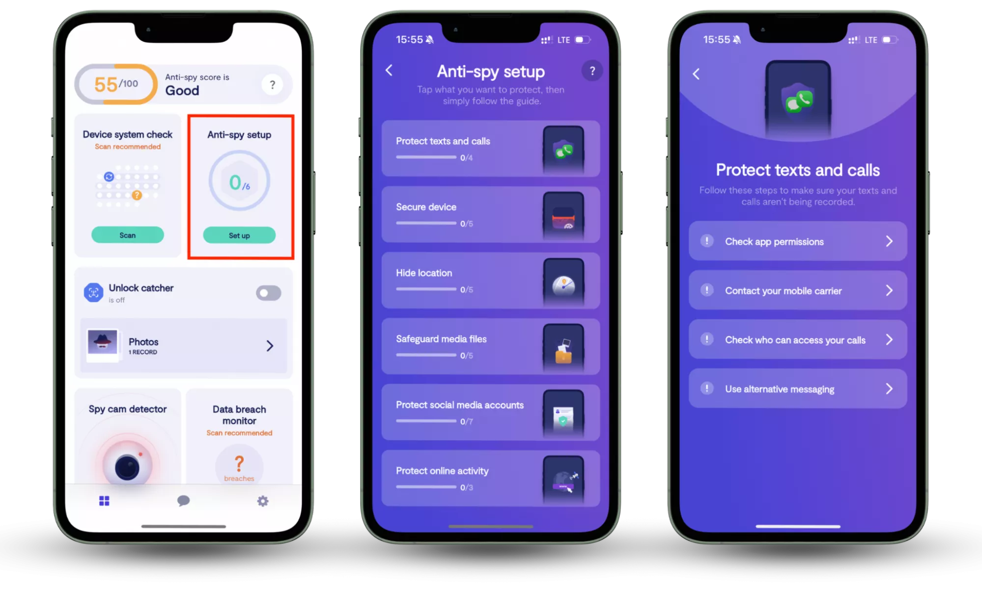
One feature that aligns closely with resisting dark patterns is Clario Anti Spy’s Anti-spy setup. Rather than automatically blocking threats, it provides a step-by-step checklist that helps users review system settings commonly exploited through deceptive design. This includes checking app permissions for access to location, camera, microphone, and background activity—areas where vague prompts and misleading consent screens are often used.
Here is how to use Clario Anti Spy’s Anti-Spy setup feature:
- Download Clario Anti Spy, create an account, and sign in.
- Under the Anti-Spy setup section, select Set up.
- Follow the step-by-step Anti-Spy Setup to review app permissions and system settings that are often affected by misleading consent prompts. Adjust access to sensitive features—such as location, camera, microphone, and background activity—to reduce unnecessary data exposure.

By guiding users through these settings in plain language, Anti-Spy Setup encourages more deliberate decisions and reduces the chance that hidden permissions or unnecessary data access go unnoticed. This approach supports long-term privacy awareness and complements the habit of carefully reviewing on-screen choices when interacting with apps and websites.
Conclusion
Beyond individual inconvenience, dark patterns have broader implications for digital trust. When users repeatedly encounter deceptive interfaces, confidence in online services erodes. Encouraging transparency and ethical design not only protects consumers but also supports a healthier digital ecosystem where informed choice is the default rather than the exception.
At the individual level, combining awareness with practical tools can help reduce the impact of manipulative design. Solutions like Clario Anti Spy, particularly its Anti-spy setup, support this effort by guiding users through permission reviews and privacy settings—making it easier to spot unnecessary access and regain control over personal data.
Read more:


